


Typography, or as most people would refer
to this art form, lettering, is ubiquitous within our contemporary
society.
The words and numbers engaged everywhere that
our eyes may settle are primarily intended for visual communication.
These
forms are vehicles for information whether from a practical sense or for a more
abstract purpose.
Typography has become a vehicle for post
modernist design over the past 30 years.
Some may say that this style of typography it is not intelligible, not
legible and therefore a pointless exercise.
Others may just enjoy looking at
the letterforms as a visual object that communicates a notion on a more
expressive or emotive level rather than an analytical, immediate, objective
level.
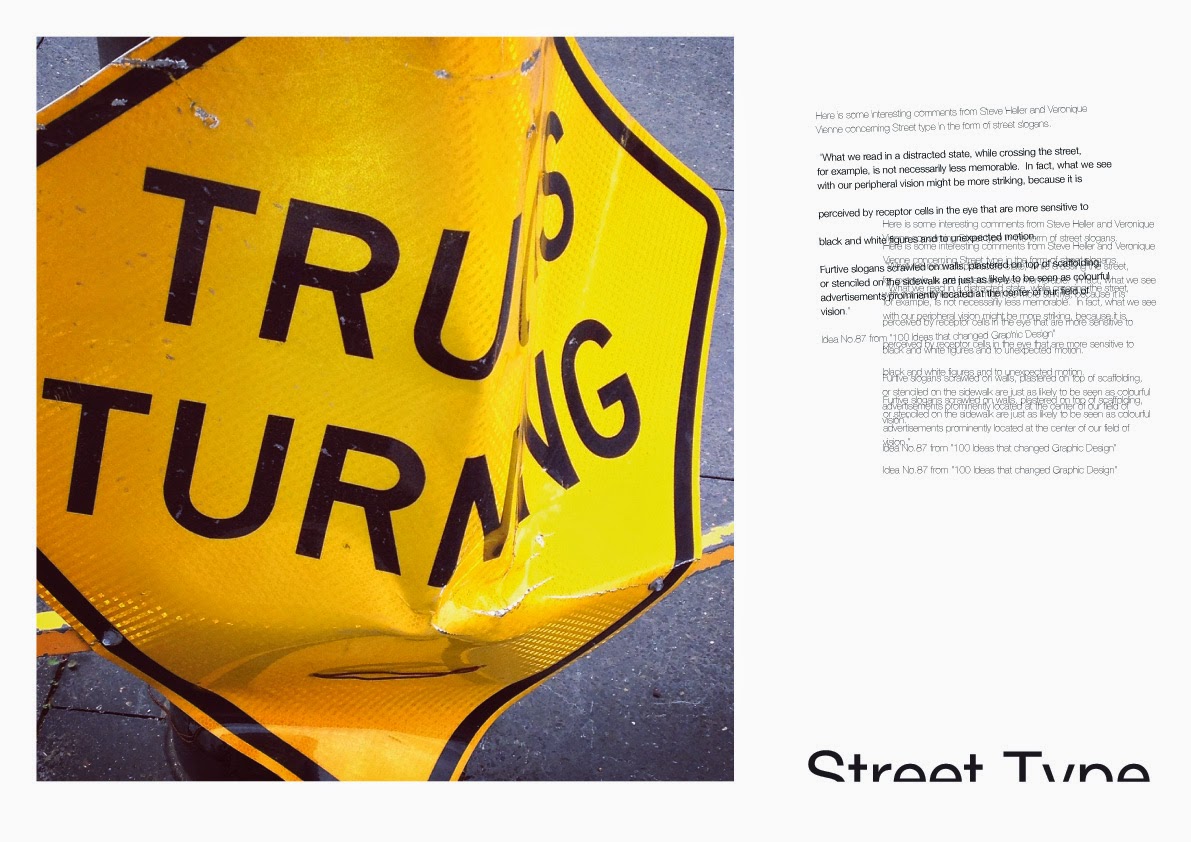
These pages show some examples of street
type that have not started out as an exercise of postmodern thinking…
but haves
found themself distorted into something other than their original intent.
Looking at the letterforms of most
alphabets (dreadful script fonts do not count) one can find the perfect form
and balance that has been inspired nature;
the perfect balance between negative
and positive spaces.
All of these
observations help one’s sensibilities in appreciating the world around us, in
all its forms (2D, and 3D).
The following paragraph from '100 ideas that changed Graphic Design' written by Steve Heller and Veronique Vienne addresses Street type in the form of street
slogans.
“What we read in a distracted
state, while crossing the street, for example, is not necessarily less
memorable.
In fact, what we see with our
peripheral vision might be more striking, because it is perceived by receptor
cells in the eye that are more sensitive to black and white figures and to
unexpected motion.
Furtive slogans scrawled on walls, plastered on top of
scaffolding, or stenciled on the sidewalk are just as likely to be seen as
colourful advertisements prominently located at the center of our field of
vision.”
Idea No.87 from '100 Ideas that changed Graphic Design'.
Because this area of the visual world is so important to us all, there exists many different opinions and theories and practitioners.
Because this area of the visual world is so important to us all, there exists many different opinions and theories and practitioners.
All these thoughts are
valid if they assist us in coming to some understanding of what we are looking
at and how it affects us.
Willi Kunz, an important German typographer, wrote a wonderful
book entitled ‘Formation + Transformation’, and the following passage comes
from said publication,
“Regardless of what style (of typography) is pursued, an
important criterion in evaluating a design is clarity.
Good typography is clear
typography.
The designer’s intent must
be immediately clear and the design must speak with an unmistakable, clear
voice that penetrates today’s clamorous visual environment”.
The video below is a wonderful example of
what Kunz has stated.
Type must communicate.
Typography must adds value to our
world and not be yet another piece of visual rhetoric that contributes to
the confusion that surrounds us.
http://vimeo.com/36167291 Street typography from Tom Williams