
SHIFTAZINE is about celebrating what is out there, already in your life, right in front of you. SHIFTAZINE aims to give some useful insights, to pose some questions, and to make you look at everything differently. Hopefully, it will help shift the contemporary perception of beauty and aesthetics. SHIFTAZINE is created by Jacqueline Hill and is associated with DESIGNASAW.
29 January 2015

27 January 2015
A Colour Diary

A little while ago a room in my home was repaired and repainted.
In the course of the renovations some parts of the walls were rubbed back.
What was revealed was a brief history of the colours that had been engaged over the 130 odd years of the house's life.
The colours we select to surround us must reflect were we are emotionally...it simply can not.
Colours are a constant necessity in our lives just like air is.
Next time you are changing the colour of your space, think about what you need in life and then find a colour that will help you find it.
20 January 2015
Street Type

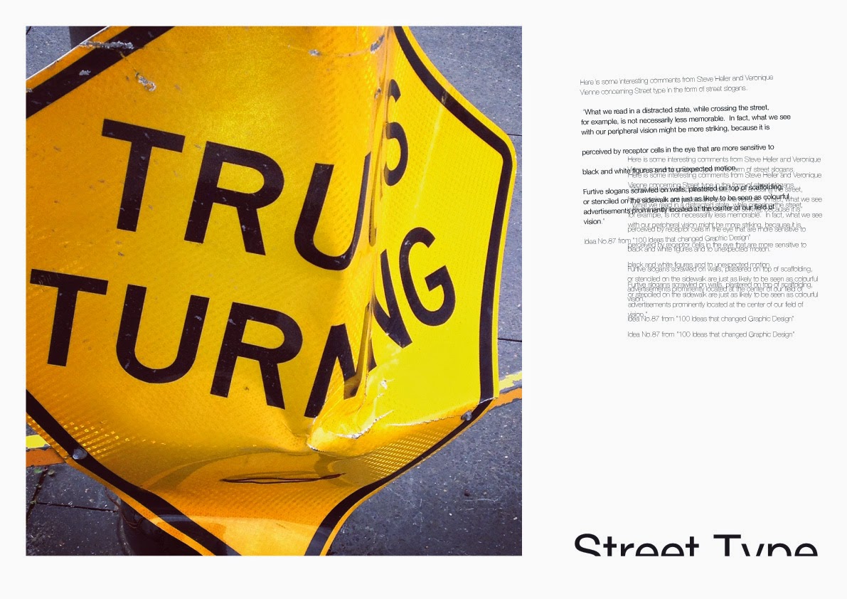

Typography, or as most people would refer
to this art form, lettering, is ubiquitous within our contemporary
society.
The words and numbers engaged everywhere that
our eyes may settle are primarily intended for visual communication.
These
forms are vehicles for information whether from a practical sense or for a more
abstract purpose.
Typography has become a vehicle for post
modernist design over the past 30 years.
Some may say that this style of typography it is not intelligible, not
legible and therefore a pointless exercise.
Others may just enjoy looking at
the letterforms as a visual object that communicates a notion on a more
expressive or emotive level rather than an analytical, immediate, objective
level.
These pages show some examples of street
type that have not started out as an exercise of postmodern thinking…
but haves
found themself distorted into something other than their original intent.
Looking at the letterforms of most
alphabets (dreadful script fonts do not count) one can find the perfect form
and balance that has been inspired nature;
the perfect balance between negative
and positive spaces.
All of these
observations help one’s sensibilities in appreciating the world around us, in
all its forms (2D, and 3D).
The following paragraph from '100 ideas that changed Graphic Design' written by Steve Heller and Veronique Vienne addresses Street type in the form of street
slogans.
“What we read in a distracted
state, while crossing the street, for example, is not necessarily less
memorable.
In fact, what we see with our
peripheral vision might be more striking, because it is perceived by receptor
cells in the eye that are more sensitive to black and white figures and to
unexpected motion.
Furtive slogans scrawled on walls, plastered on top of
scaffolding, or stenciled on the sidewalk are just as likely to be seen as
colourful advertisements prominently located at the center of our field of
vision.”
Idea No.87 from '100 Ideas that changed Graphic Design'.
Because this area of the visual world is so important to us all, there exists many different opinions and theories and practitioners.
Because this area of the visual world is so important to us all, there exists many different opinions and theories and practitioners.
All these thoughts are
valid if they assist us in coming to some understanding of what we are looking
at and how it affects us.
Willi Kunz, an important German typographer, wrote a wonderful
book entitled ‘Formation + Transformation’, and the following passage comes
from said publication,
“Regardless of what style (of typography) is pursued, an
important criterion in evaluating a design is clarity.
Good typography is clear
typography.
The designer’s intent must
be immediately clear and the design must speak with an unmistakable, clear
voice that penetrates today’s clamorous visual environment”.
The video below is a wonderful example of
what Kunz has stated.
Type must communicate.
Typography must adds value to our
world and not be yet another piece of visual rhetoric that contributes to
the confusion that surrounds us.
http://vimeo.com/36167291 Street typography from Tom Williams
15 January 2015
Look a little closer

Look at little closer at this image and you will find more than you initially thought was there.
It is full of tiny details and textures and things that people have taken the time to say visually.
The ‘street’ and the passive walls that define this universal space offer themselves to artists or anyone else who feels the need to utilise them as a platform to make a statement.
Wallism
is truly a modern movement within art. It is ubiquitous and global.
This example is from Hackesche Höfe, Berlin. (Got to love Berlin!)
11 January 2015
Great taste

Taking it all in, not just looking at
what’s around you but truly absorbing the experiences, and the feelings these
experiences trigger, is so essential.
It is a good thing to allow the places,
experiences, and objects that have been apart of your summer, to become apart
of you because being conscious at all times is not tiring, it’s
enlivening.
These images are some of shiftazine’s summer moments at Roller
Door Cafe in Islington, Newcastle Australia.
A place where there is always
delightful creative expression present both on the walls and in your coffee
cup.
10 January 2015
Steps of Butter

THERE IS A HOUSE in the inner city area of
Redfern that has stood for 132 years.
It has a staircase that is made of wood.
This wood is now old and worn and has been painted and stained and vanished many, many times.
It would be
impossible to estimate how many feet have trodden up and down these stairs but
the evidence of these journeys is present in the wear of the
tread.
So this staircase needed a refresh. It needed some care and a new
look.
And then a smart, articulate
artist called Yiorgos said...”Why don’t you paint them fluro yellow?” “Why
not!” was the response.
The paint was
purchased but only after a long debate at the paint store about what was being
done. (Everyone has an opinion.)
The stairs were scrapped and sanded and filled
and sanded and undercoated and sanded and THEN FINALLY painted.
Not once, not
twice but three times.
AND NOW there is
a stair case that looks like its made of butter.
08 January 2015

23 December 2014
Joy to the world

I truly hope it has brought you all a little joy.
Soon a new year is upon us and I am sure it will be filled with more inventive, and witty ideas soon to be realised.
A wonderful and joyful time to you all. Love Shiftazine.
17 December 2014
Blue: “Whenever I feel blue, I start breathing again”


Blue is a colour that is constant in all our lives.
Australia is defined by its unbelievable blue sky, and is only rivalled by a Cretan blue sky.
One longs to dive into this blueness if only gravity did not get in the way.
No matter where you are in the world, it is always there.
It is associated with the notion of reliability, and therefore the colour is a part of the fine Australian expression 'true blue' which is self explanatory.
The information below is but a small selection of interesting facts concerning this primary colour.
If you want to know more about blue and all the other colours, read a great book called 'Color' (American spelling) by Victoria Finlay.
It is full of delightful insights that will deepen your love and curiosity for all the colours in the spectrum.
The modern English word blue comes from Middle English bleu or blewe, from the Old French bleu, a word of Germanic origin, related to the Old High German word blao.
In heraldry, the word azure is used for blue.
In Russian and some other languages, there is no single word for blue, but rather different words for light blue (голубой, goluboy) and dark blue (синий, siniy).
Several
languages, including Japanese,
Thai, Korean, and Lakota Sioux, use the same
word to describe blue and green.
For example, in Vietnamese the colour of both
tree leaves and the sky is xanh.
In Japanese, the word for blue is often used for colours that English speakers
would refer to as green, such as the colour of a traffic signal meaning
"go".
Blue is
traditionally associated with the sea and the sky, with infinity and distance.
The uniforms of sailors are usually dark blue, those of air forces lighter
blue.
The expression "The wild
blue yonder refers to the sky.
Blue is
associated with cold water taps which are traditionally marked with blue.
Bluestocking
was an unflattering expression in the 18th century for upper-class women who
cared about culture and intellectual life and disregarded fashion.
It
originally referred to men and women who wore plain blue wool stockings instead
of the black silk stockings worn in society.
Blue is often
associated with melancholy-
having the "blues".
In the
late Roman Empire,
during the time of Caligula,
Nero and the emperors who
followed, the Blues were a popular chariot racing team which competed in the Circus Maximus in Rome
against the Greens, the Reds and Whites.
In the Byzantine Empire, The
Blues and Greens were the two most popular chariot racing teams which competed
in the Hippodrome of
Constantinople.
Each was connected with a powerful political
faction, and disputes between the Green and Blue supporters often became
violent.
After one competition in 532 AD, during the reign of the Emperor Justinian, riots
between the two factions broke out, during which the cathedral and much of the
centre of Constantinople were burned, and more than thirty thousand people were
killed.
(http://en.wikipedia.org/wiki/Blue#cite_note-7)
Subscribe to:
Posts (Atom)